
UX e-commerce feature design for a luxury watch brand
Designing Confidence in Luxury E-Commerce
Role
UX Designer
Industry
Retail
Skills
Design Ideation, Competitive analysis, Wireframing, Protoyping, Brand Identity

Problem Statement
Background
Making a positive difference to the customer in a high-friction industry
Stratum’s primary audience consists of first-time and early-stage watch collectors who value craftsmanship and emotional significance over trend-driven design. While interested in mechanical watches, many lack the confidence and expertise of seasoned collectors and rely on digital experiences to guide their purchase decisions.
They are willing to invest between $500–$2,500 in a single, versatile timepiece intended to mark a meaningful life moment or serve as a deeply personal gift. For these customers, caseback engraving is a key differentiator—but also a source of hesitation due to its permanence and lack of return options.
Rather than seeking the lowest price or bold aesthetics, they prioritize trust, reassurance, and a sense of connection to the product before committing to purchase.
Research
Opportunites to improve in a crowded field
The luxury watch space is a large and varied place, with a lot of businesses vying for a the eyeballs of a few who want to invest in a special, and potentially very expensive, keepsake. Custom engraving on the caseback - a name or place, an important date, a meaningful phrase - is a way to add value to just the right user. There are quite a few brands that offer this as an online ecommerce experience, but from a competitive analysis of key competitors we found areas for Stratum to capitalize. My approach focuses on real-time on-watch engraving previews, a saved-draft + confirm checkpoint, and mobile-first ergonomics to reduce anxiety and drop-off.
Research Insights:
All brands use reassuring copy and service language so I must match that baseline (turnaround, permanence, pricing) and exceed it with interaction
Real-time, accurate on-watch previews reduce perceived risk. Users have an expectation that they will see what they are paying for.
Little evidence competitors add deliberate confirmation checkpoints that explain permanence, offer a saved preview, or let users ‘sleep on it’ (drafts / delayed engraving). Adding a short, friction-controlled confirmation improves conversion and reduces post-purchase regret.
The engraving experience is usually desktop-biased in marketing; make the flow thumb-friendly, with large type, limited input fields, and an uncluttered preview.
Curated microcopy options (e.g., “Wedding date”, “Coordinates”, “Short message examples”) can reduce cognitive load and speed decisions.
Design Process
Creating confidence in the place of anxiety
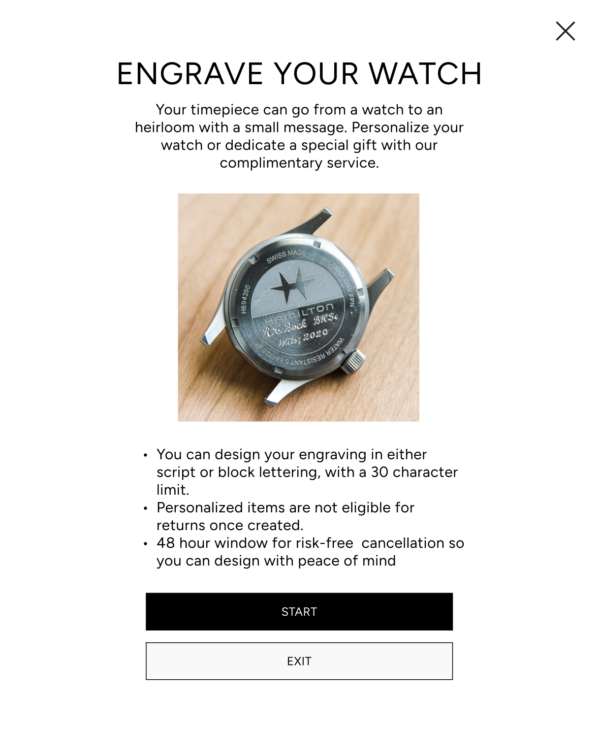
I designed product detail pages and a special flow for the custom engraving process to not only reduce decision paralysis and drop-off but also create experience that encourages users of the benefits of personalization while informing them of the risks.
The site will have the following key constraints:
Support optional caseback engraving within the purchase flow
Modern product detail pages that fit in with industry trends and inspire user confidence
Optimize for both desktop and mobile users
Reduce user anxiety caused by non-returnable personalized orders
Design Ideation
Flow Map
A Focused flow showing how the guided engraving experience reduces anxiety at a key decision point before checkout.
Design Ideation
Wireframing
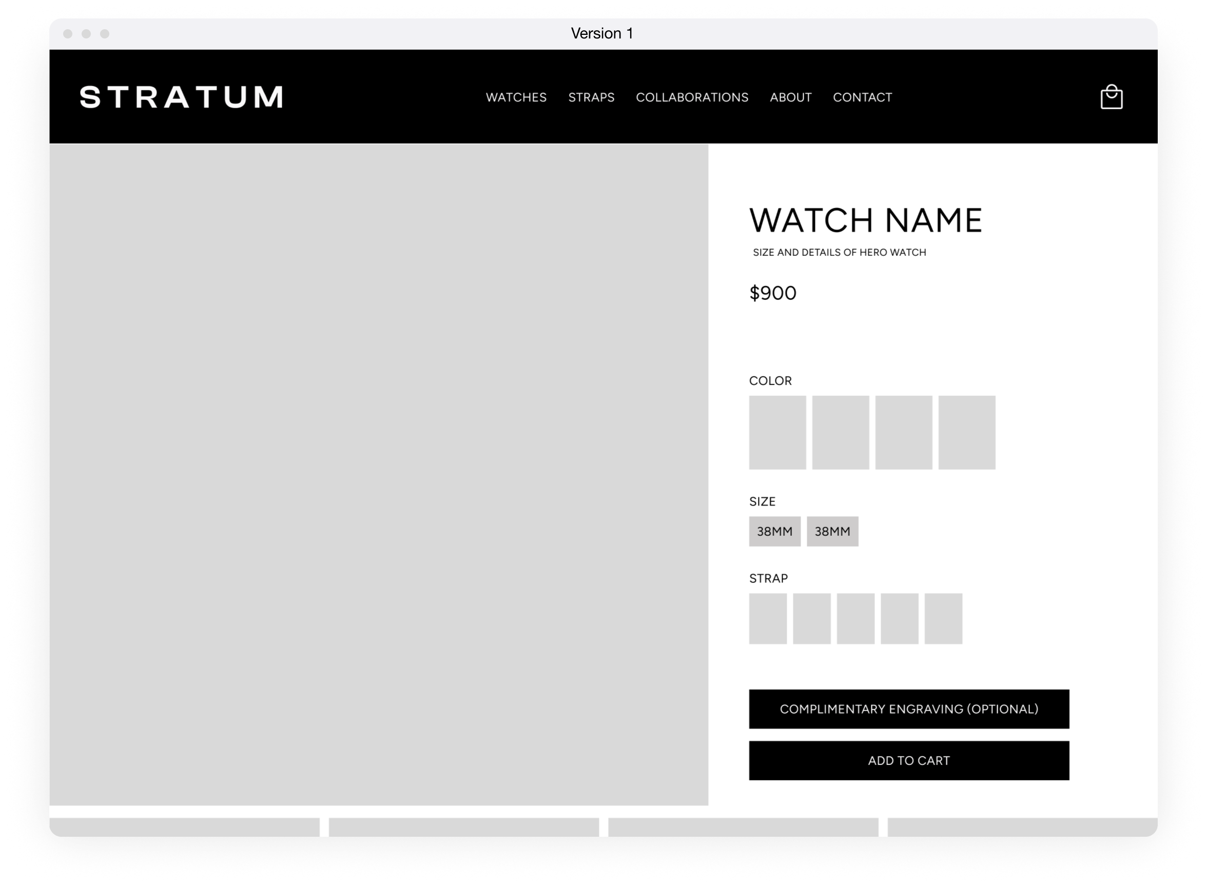
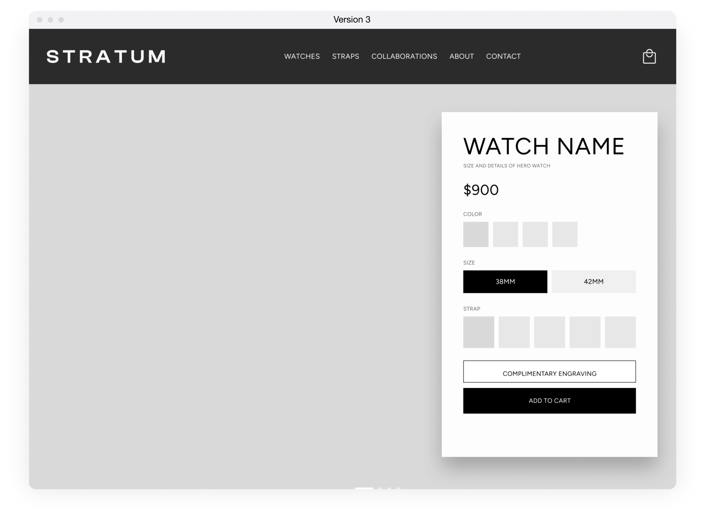
I set to work designing mid-fi iterations of the product detail page. As shown in my competitive analysis, it was essential that my designs feel in-step with existing brands in the luxury watchmaking space, while retaining modern UI and an experience that feels at home in both desktop an mobile. The plan was not to reinvent the wheel, but to use this as an opportunity to build user trust in the design. When users are making complicated decisions where high expense and risk is involved, every touchpoint is a space to make them feel confident and comfortable.
Mid-fi wireframes of the product detail page for desktop view show 3 different iterations of the elevated, confident shopping experience with a seamless transition between the two spaces.
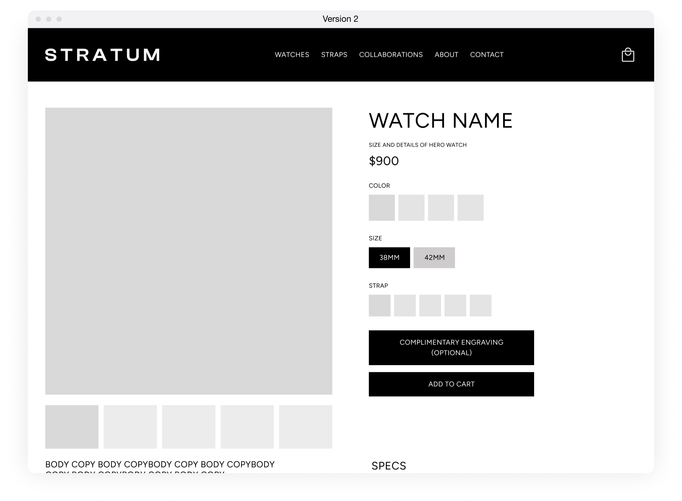
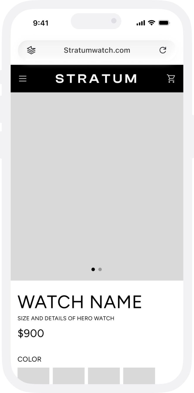
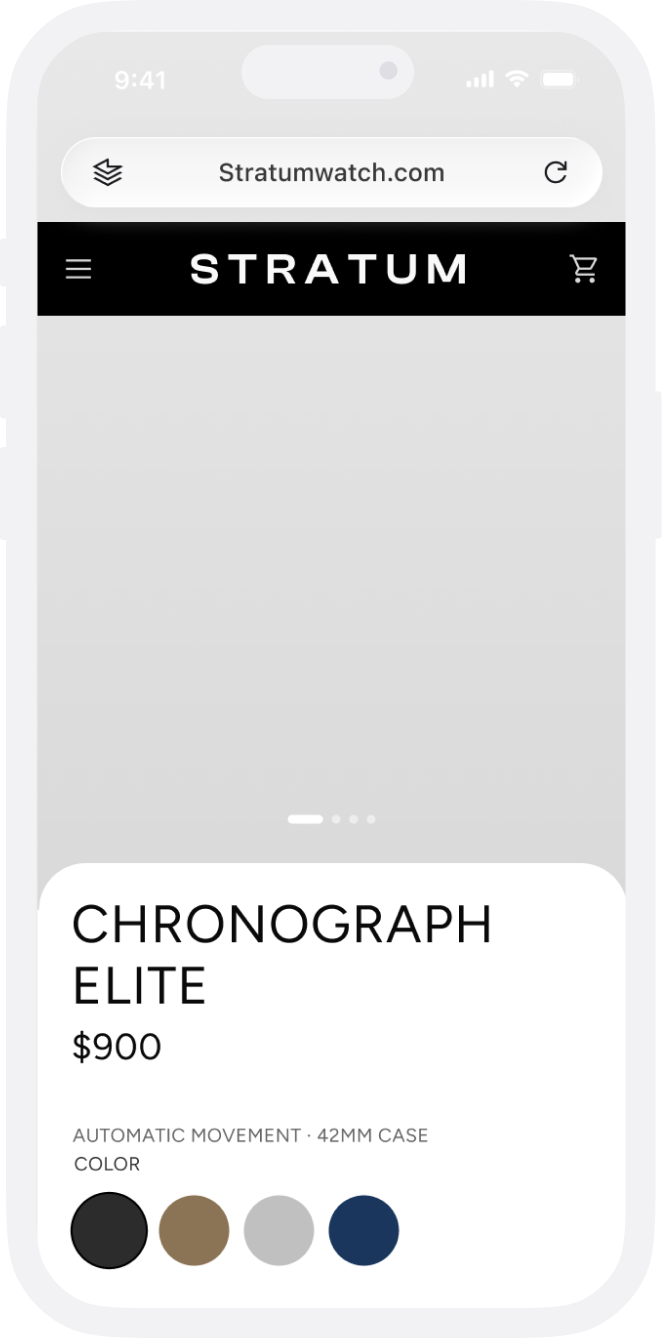
The mobile experience need to maximize the strengths of thumb-based users while continuing the same luxury experience. Version 2 was pushed forward into the final design, allowing for an elegant and uncluttered experience that emphasized product photos to engage users on small screens.
Version 1
Version 2
I set about wireframing the flow for the custom engraving service, taking extra effort to consider ease of use and clarity of the experience
Final Designs
Customizations that produce user confidence
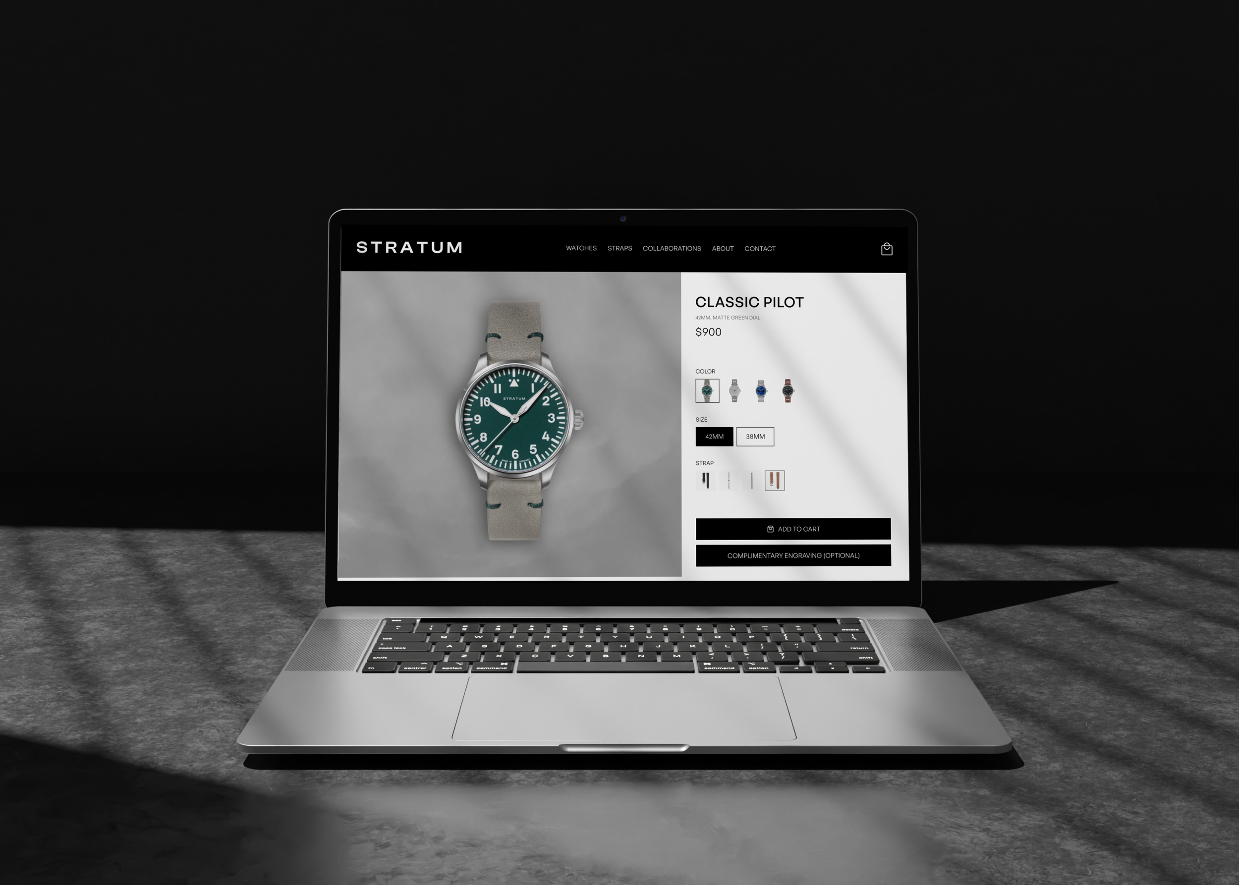
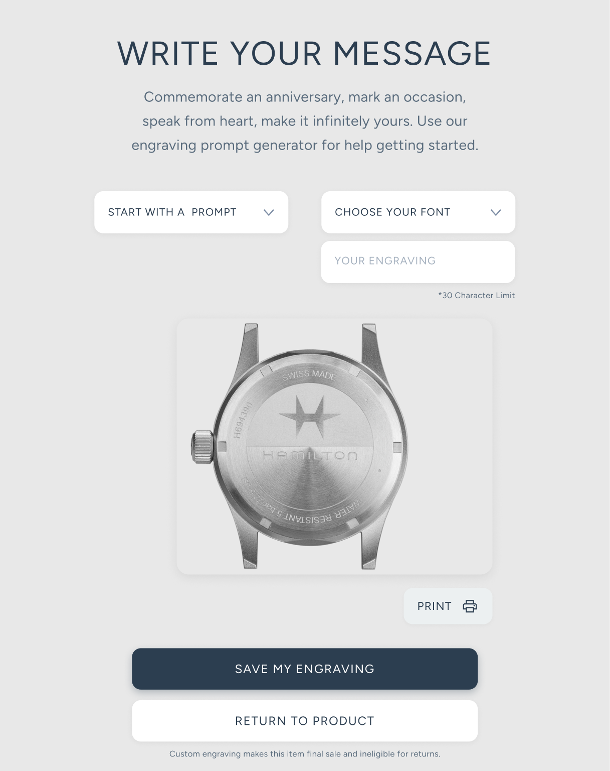
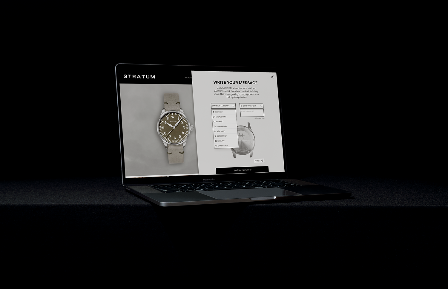
These final designs illustrate a confidence-driven custom engraving experience for first-time watch collectors navigating irreversible personalization decisions. The interface emphasizes clear guidance, real-time previews, and deliberate confirmation moments to help users feel informed and assured before completing their purchase. In addition to a desktop size, the designs are showcased in mobile format to show ease of use of the UI regardless of device, and showing that a task perceived as complicated is made just as easy on the mobile format. The UI fonts were updated from the wireframing stage to promote readability and stronger brand alignment.
Success would be measured by:
Reduced checkout abandonment for personalized orders
Higher completion rates in the engraving flow
Positive usability testing feedback around confidence and clarity
Strong post-purchase sentiment related to personalization
The product detail page was created through a combination of each wireframe iteration - the layout from version 1, the buttons from version 2, and the right side panel from version 3, leading to a very refined, modern shopping experience with all details at your fingertips above the fold. The UI font was changed to better sit within established brand guidelines.
For the mobile design, I changed the dial color selection tool to be more mobile friendly, removing the small preview images in favor of easy to tap color pads. Pressing one makes the hero photo change to the users desired selection.
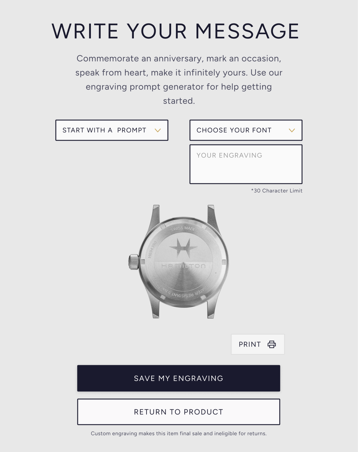
The custom engraving flow features decision affirming language and gives users a concrete understanding of both the risks and positive benefits at the same time. Users are given options not only to write their own message, but also useful prompts to help them find the perfect language for them, reducing decision paralysis. A live preview of the engraving on a real watch caseback helps user understand exactly what they are ordering.
The language and typography used throughout the engraving flow ensures that users understand the permanence of the decision they are making and expands on the benefits of using the engraving service, making the experience more positive
For the future
Expanding the vision
Next steps for this project would be to expand this concept of reducing high friction and increasing user confidence through more specific feature builds. I will refine the checkout process to include the visual proof of the custom engraving with the added ability to change or cancel from that point, as well as an additional confirmation screen at the end of the process. After that, I will design and iterate on solutions for navigation for the site, so that personalization options can be searchable along side the watches themselves using a megamenu system.