
Responsive website design and build for TitoparaTI, an accident victims advocate
Creating a resource of trust and safety for a vulnerable community
Role
Web Designer, UX/UI Designer
Industry
Legal
Skills
Design Ideation, Research, Wireframing, Protoyping, Web Design
Research
Connecting a business formed in 1981 with the modern day personal injury law industry in the online space.
TitoparaTI was looking to retain its original status as a dominant force in the California legal advocacy space but needed to be able speak its message to younger hispanic people in 2025. A competitive analysis revealed a crowded market with similar messaging being “shouted” at users rather than spoken with authority. Seemingly endless law firms using all-caps text, a lot of blue colored branding, and aggressive messaging about “winning big.” All competing sites used messy and clumsy UI for their goal of generating leads. Particularly in the hispanic market, some competitors had "Spanish language only websites rather than giving users the ability to choose. These insights offered a path to create an engaging website that stood out from the pack and connceted users with consistent brand messaging to create trust.
Research Insights:
Users need a way sign up for the service without feeling pressured
More users looking for legal help are using their phones primarily, so a great mobile experience is key
Use of cinematic video and images will help the site stand above competition
The site needs to function perfectly in Spanish as well as English. Many users will be Spanish speakers but research shows they will be used to using english language on devices, important to give users the choice
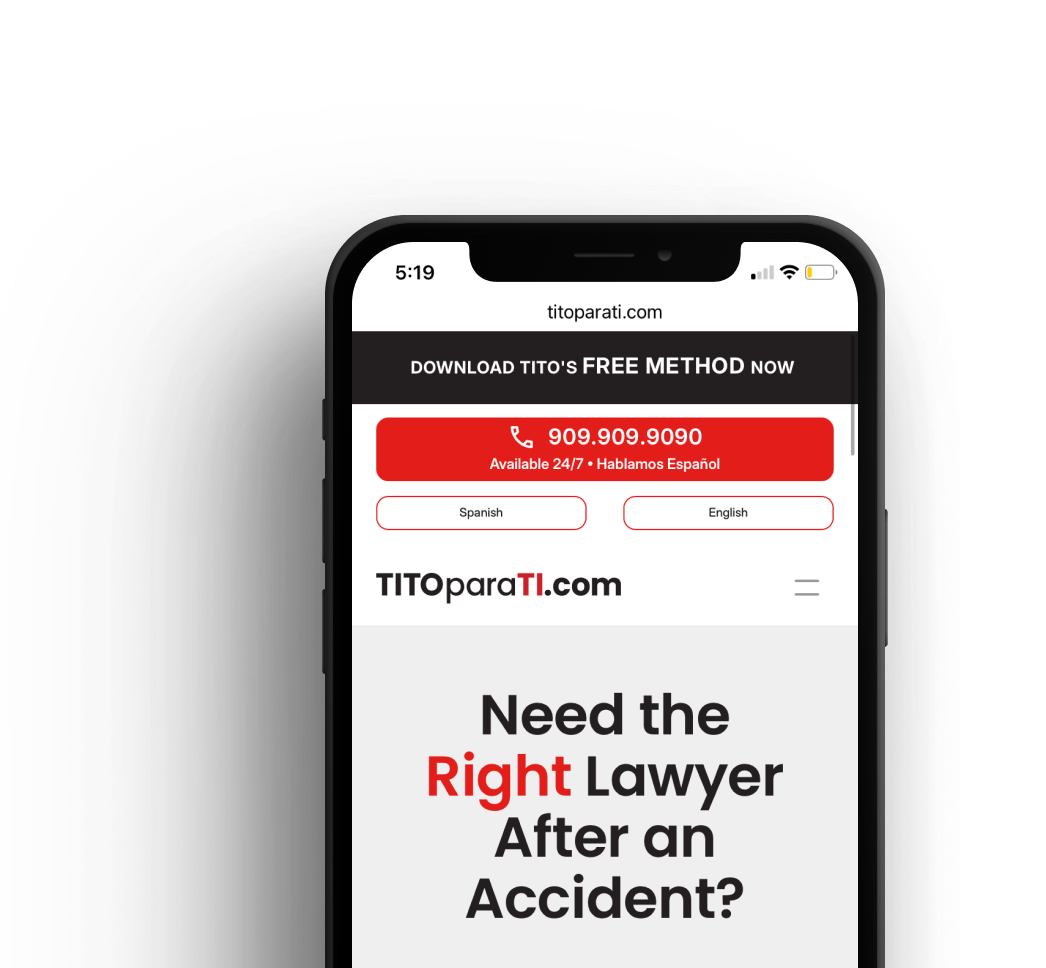
Easy to use mobile buttons to trigger a direct phone call helps for many users who struggle with computer literacy
Design Process
A fully responsive website built for two languages to ensure user trust
After thoroughly analyzing research and engaging in client discussions, I embarked on designing a website to optimize the delivery of the core brand message while creating a safe space for users get connected with the legal advocate they desperately need
The site included features such as:
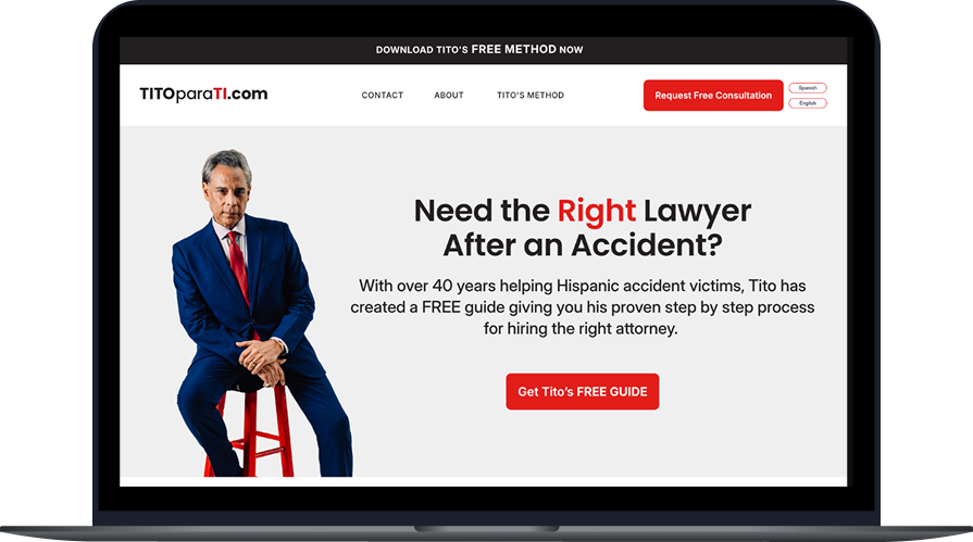
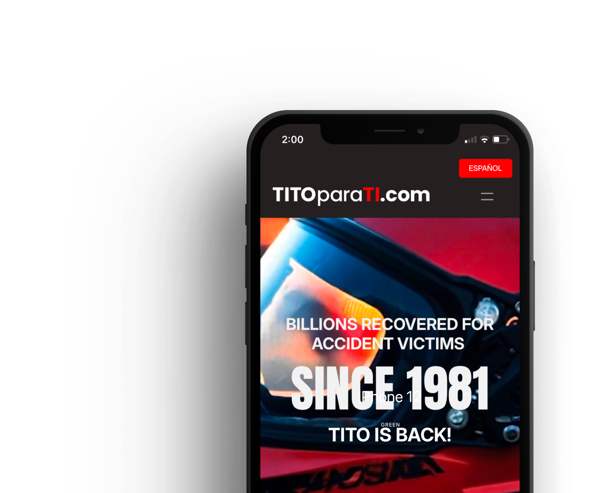
An Engaging Homepage: Cinematic visuals that play and engage users to understand the brand’s mission without requiring excessive reading.
Bilingual site: Enabled users to easily switch between english and Spanish while experiencing the same level of design
Clean UI with Call Now Buttons: Allowed users to easily make phone calls to instantly connect with TitoparaTI without leaving the website.
Easy to use signup forms: simple bilingual intake forms that capture leads into the company’s CRM
Flowing, Uncrowded Text: Telling the story of TitoparaTI in a captivating way, but never burdening the user to read too much
Service Pages: Content Management System driven pages that allow for improved SEO and provide users with the authoritative information the expect to find to make them feel trusting of the client’s services.
The result was a streamlined and engaging website that captivated users and led to 65 new clients for TitoparaTI within 1 month of launch.
Design Ideation
Wireframing
I took all research and conversations with the client and got to work ideating the site. Below is a look at the journey of the site’s homepage, which continually moved towards a darker and more cinematic feel. This allowed TitoparaTI’s story to be told in a way that aligned with the brand vision while leveraging a UI design that made actions on the site crystal clear, contributing to a sense of trust.
These early iterations of the homepage allowed for design exploration to find the balance of information, CTA, and cinematic imagery


These early iterations of the homepage allowed for design exploration to find the balance of information, CTA, and cinematic imagery


Insights from testing
Refinements to match brand tone and improve user experience
Early versions of the homepage provided good flow of information but lacked some of the cinematic feeling that this brand uses to tell its story in TV and social media advertisements. After a long period of ideation on how to include this vision, I landed on having an auto playing video in the background of the hero section. On launch, users see a recut version of the brand’s TV ad with wording and simple CTA buttons on top. This flows down into sleek sections with more information about the brand and its services, never overwheming the user.
Another big change we made for increased usability was a redesign of the language “switcher” button. Due to the vulnerable nature of the clientele, ease of use for viewing pages in Spanish was the utmost concern of my client. The original design was simple, giving the two language options in the navigation. Testing showed that users didn’t always click for their desired language, so I refined this feature on mobile view to be a single button, written in the correct language that the user would want to view, simplifying the choice.
New Homepage
Original Homepage
Original Homepage
Redesigned Homepage

Old Language Switcher
New Language Switcher
Original Language Switcher
New Language Switcher
Final Designs
Cinematic design with clear UI makes impact with users
The final design for TitoparaTI came together as a space where users could clearly achieve their goals of learning more about the brand and being connected with a legal advocate. These users are in a vulnerable position, some being the victims of an accidents and needing help, while also needing Spanish language assistance. I was able to create a site that accomplished this with proven feedback - after launch the site saw early traffic of 30,000+ page views in the first 30 days, and well over 300 form submissions. All this led to TitoparaTI taking on 65 confirmed new clients in the first month live.

For the future
Expanding the vision
Feedback on the design has been positive, with users finding it intuitive and easy to use for their information gathering and signup experiences. As I continued iterating, I saw that the company would need more ways to engage potential clients. Expanding their marketing efforts to include a space where clients can interact with a “member’s only” section of the site would allow me to design a space to house content that could be of real benefit to users. Future iterations will also include more simple ways to connect with the company, including the use of a chat widget and a connection to the company’s CRM to send text messages directly to users.